martes, 15 de mayo de 2018
lunes, 14 de mayo de 2018
The art of Simon Moulijn, 1866–1948
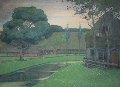
Landscape, Drenthe (1896). Collection Hein Klaver.
Sander Bink’s previous guest posts here concerned some of the forgotten artists of the Dutch fin de siècle, in particular the Beardsley-inspired work of René Gockinga. This new post from Sander is more Symbolist-oriented, with a look at the work of another Dutch artist.
* * *
Simon Moulijn was a Dutch painter and graphic artist whose work shows a striking affinity with European Symbolism, in particular his prints and paintings made in the 1890s which would appear to provide a link between Dutch Realism and mystical Symbolism. Beyond their historical context, these are simply beautiful pictures which is, of course, the most important thing.
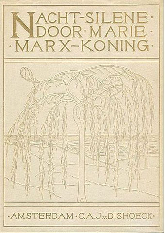
Cover design for Nachtsilene, 1902.
Landscapes were Moulijn’s main theme; some bring to mind the land- and cityscapes of Fernand Khnopff in which the world has become silent: a serene, quiet world, free from the noise and misery of modern life. “Anywhere out of this world”, but within the world we already know. Although not “Decadent” like Khnopff—there are no femmes fatales in his landscapes—Moulijn must certainly have been inspired by Khnopff and similar artists. Van Gogh and Jan Toorop were important for Moulijn as well. That Moulijn was well-versed in Symbolism and other new art forms at the time such as Art Nouveau is evidenced by his exhibition at Siegfried Bing’s Paris Gallery in 1895. Like many of the artists of his generation, he was greatly inspired by the mystical writing of Maeterlinck. No wonder, then, that he designed book covers and illustrations for Marie Marx-Koning, a Dutch writer unjustly neglected today, whose novels and stories also show a strong affinity with European mystical Symbolism.
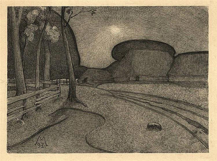
Night (1893). Lithograph.
These qualities are already exemplified by Moulijn’s first printed work, the lithograph Night from 1893 which depicts a traditional Dutch subject, a farm; but there are no peasants, and the nightly tones and silence make it look more like a farm from an Ingmar Bergman film than a landscape by his painter contemporaries from The Hague School.
Farm at Diphorn (1896). Gemeentemuseum Den Haag.
Spring (1896). Drents Museum.
Autumn (1895). Drents Museum.
An 1896 painting with the same subject, Farm at Diphorn, brings to mind the imaginary landscapes of Félix Vallotton, as do, more or less, two pastels which I personally feel to be his best: Spring and Autumn. Once again, the coloured areas in these Symbolist landscapes are reminiscent of a Vallotton or Franz Melchers. But where Vallotton’s landscapes might be characterised as psychological landscapes, these two by Moulijn are almost abstract experiments in colour.
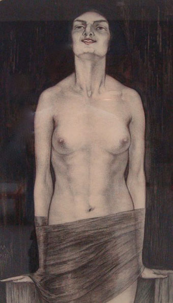
Vampire (1916). Collection Van Wezel.
Finally mention must be made, for curiosity’s sake and to satisfy the reader’s Decadent needs, of the 1916 coloured lithograph Vampire. This demonstrates Moulijn’s affinity with a more Decadent Symbolism, although by this time the style was increasingly outmoded.
Previously on { feuilleton }
• René Gockinga revisited
• Gockinga’s Bacchanal and an unknown portrait of Fritz Klein
• More from the Decadent Dutch
Weekend links 411

The Temple of Love (1911–24) by Herbert E. Crowley.
• My film viewing in the 1980s involved a considerable amount of backtracking: watching any film noir that turned up on the TV while chasing the early works of David Cronenberg, and various “New Hollywood” classics on television or at repertory cinemas (when such things were still plentiful). Contemporary fare by comparison was often a lot less attractive, although I’d be waiting for new work from David Lynch and Nicolas Roeg while pursuing obscurities (usually the banned or censored) on videotape. Popular films seldom generated actual loathing but throughout the decade I nurtured a persistent hatred for the works of John Hughes, an animus that can still return today when I read yet another nostalgic article about his oeuvre.
The monoculture of the 1980s was writ large on American cinema of the decade. From Arnold Schwarzenegger’s muscle-rippling actioners to John Hughes’s adolescent confections, bombastic, generally upbeat films characterised the decade of the yuppie.
Christina Newland offers a welcome riposte to the pastel-hued retrospectives in a piece entitled “Reagan’s bastard children: the lost teens of 1980s American indie films”. While not exclusively teen pictures, I’d have mentioned three low-budget films written by Eric Red: The Hitcher (1986), Near Dark (1987) and Cohen and Tate (1989).
• The Temple of Silence: Forgotten Works & Worlds of Herbert Crowley is a lavish (and costly) study of the strange comic strips and incredibly detailed drawings of Herbert E. Crowley (1873–1937). Mark Newgarden interviewed Justin Duerr about rescuing Crowley’s art from undeserved neglect. I missed an earlier interview by Steven Heller with Temple of Silence publisher Josh O’Neill. There’s more: The Wiggle Much a Tumblr devoted to Crowley’s comic strips and other artwork. (Ta to Jay for the tip!)
• Pandemic is an interactive film by John Bradburn for The Science Museum. “A pandemic is causing heart failure–how far will you go to create a pig/human hybrid to provide donor organs?” The multiple choice begins at YouTube; there’s also a behind the scenes feature at the Museum blog, and a trailer. Anyone who remembers a certain scene in Lindsay Anderson’s O Lucky Man! may hesitate before playing.
Given the plain palette of so much 1969–70 rock—jammed-out bluesy boogie in the Canned Heat and Allman Brothers mode, nasal pseudo-country harmony singing à la CSN&Y and their afterbirth—it is tempting to imagine an entirely alternative history for rock. It’s a parallel world where Fifty Foot Hose’s Cauldron, United States of America’s self-titled album and synthedelic oddities from Syrinx, Silver Apples, Beaver & Krause and Tonto’s Expanding Head Band were just the run-up to a giant leap into the electronic future.
Simon Reynolds in an excellent piece on one of my favourite musical sub-genres, electronic psychedelia
• The week in animated film: Emerald Rush, a video for an extract from Jon Hopkins’ new album, Singularity; Awaken Akira, a short homage to Katsuhiro Otomo’s graphic novel/film by Ash Thorp and Zaoeyo; Extra (1996), a video by one of the Akira animators, Koji Morimoto, for music by Ken Ishii.
• Tenebrous Kate on The Powers of Darkness & The Powers of the Mind: The Legacy of Jacques Tourneur’s Night of the Demon. Related: a look at the film’s shooting script and pressbook.
• At Dangerous Minds: John Gray, the pre-Bosie lover of Oscar Wilde, and the man whose surname is memorialised in Wilde’s most famous creation, Dorian Gray.
• Skewing the Picture: China Miéville posts the full text of an essay from 2016 about the rural weird.
• Share a pastrami sandwich with TED Klein in Episode 65 of Eating the Fantastic.
• More Hodgsoniana: The Land of Lonesomeness, a short story by Sam Gafford.
• At The Quietus: Barry Miles on William Burroughs’ years in London.
• At Dennis Cooper’s: Curtis Harrington Day.
• Night Of The Assassins (1977?) by Les Rallizes Dénudés | Night Of The Earth (1980) by Chrome | Night Of The Swallow (1982) by Kate Bush
viernes, 11 de mayo de 2018
El azul es un invento moderno

En 1858, el político británico William Gladstone, que se convertiría en primer ministro diez años después, publicó uno de los estudios más amplios y en profundidad sobre el que era su poeta favorito, Homero. Estudios sobre Homero y la época homérica eran más de 1.700 páginas divididas en tres volúmenes que provocaron en general la burla y crítica de los académicos contemporáneos (la idea de moda era que Homero no había existido). Pocos llegaron hasta el tercer volumen, donde estaba el descubrimiento más fascinante de Gladstone: Homero nunca describe nada como azul.
En general, su uso de los colores es extraño: hay ovejas violetas y miel verde, pero la ausencia del azul en obras como la Odisea, donde la presencia del mar es constante, llama profundamente la atención. Y no es que Homero no intentase describir nunca el color del mar que surca Ulises; es solo que lo hace como si le hubiese aplicado un filtro cutre de Photoshop. En un momento, por ejemplo, dice que es del color del vino. Y no parece que sea licencia poética.
Pocos años después, el lingüista alemán Lazarus Geiger, quizá inspirado por la observación de Gladstone, llevó a cabo su propia investigación sobre los colores en textos antiguos. No solo eran los griegos los que ignoraban este color: ni los Vedas indios ni en la Biblia ni en el Corán, obras en las que las descripciones del cielo abundan, se dice nunca que su color sea azul.
Geiger realizó otras dos aportaciones. Según sus investigaciones, los colores de las lenguas solían aparecer en el mismo orden: negro, blanco, rojo, amarillo o verde y, por último, azul. Además, la propia palabra azul, dice, en la mayor parte de las lenguas europeas modernas, viene o bien de palabras que significaban verde o bien de palabras que significaban negro. Es decir, el azul aparecía más como una tonalidad de esos colores que como una entidad en sí mismo.
¿Eran nuestros antepasados daltónicos?
La primera conclusión fácil a la que se llegaba tras estos descubrimientos era pensar que, simplemente, las civilizaciones antiguas veían peor o en una especie de escala de grises. No obstante, pocos se atrevían a defender una teoría así en plena época de Darwin. El propio Gladstone, que publicó su biblia homérica antes de que apareciese El origen de las especies, aseguró en más de una ocasión que él nunca había dicho eso que estaba en mente de todos. Pero ¿cómo saber si los antiguos griegos veían o no el azul como algo diferente?
Otro campo científico en pleno bum, el de la antropología, se unió a la investigación. Este era un momento en el que el espíritu colonialista eurocéntrico no tenía problemas en llevar hasta el zoo (¡el zoo!) de Berlín a una tribu nubia de Sudán. Allí fueron expuestos al público y sometidos al estudio de antropólogos y etnólogos, que se lanzaron sobre ellos con cintas métricas y, sí, tests de visión. Estos también los estaban desarrollando in situ en distintos rincones del mundo exploradores y científicos con las distintas tribus «salvajes» que se encontraban.
Los resultados, desde África, el Pacífico Sur a los nativos americanos, eran siempre los mismos: el orden de colores de Geiger se cumplía y el azul solía brillar por su ausencia (en algunos casos usaban el negro para describir el cielo en un día claro). Pero no era un problema de vista, ya que eran capaces de percibir la diferencia entre el azul y el verde o el negro. Simplemente, al igual que nosotros consideramos muchas tonalidades de azul el mismo color (algo que en ruso, por ejemplo, no ocurre: nuestro azul claro es golubóy; el oscuro, cíniy), ellos consideraban el azul una tonalidad del negro o del verde, pero no un color distinto: dividían el espectro de los colores en lugares distintos.
La intangibilidad del cielo
El orden de aparición de los colores en la lengua tiene una explicación: lo hacen, como todo, por necesidad. El día y la noche crean el blanco (o lo claro) y el negro (o lo oscuro), la sangre, el peligro, crea el rojo. El verde y el amarillo vienen de la naturaleza que nos rodea. ¿El azul? Podríamos señalar al cielo como evidencia, pero esta no es tan clara.
El lingüista Guy Deutscher, autor de El prisma del lenguaje: cómo las palabras colorean el mundo, cuenta en el libro que mientras investigaba sobre todo el tema de los colores, decidió hacer un experimento inocuo con su hija, que estaba aprendiendo a hablar. Le enseñó desde muy pronto a señalar y distinguir los colores y a los 18 meses ya reconocía sin problemas los objetos azules.
Mientras estaba en este proceso de aprendizaje, Deutscher tuvo mucho cuidado en no decir nunca que el cielo era azul. Cuando por esa época en la que su hija de año y medio era ya una experta en distinguir colores le preguntaba de qué color era el cielo, ella, cuenta el lingüista, se quedaba como sorprendida ante la pregunta, mirando a su padre con cara de «este se ha vuelto loco», como si el cielo no tuviese color.
Su primera respuesta llegó a los 23 meses, y fue «blanco». Un mes después dijo que azul por primera vez, y durante los siguientes seis meses fluctuó entre ambos colores hasta afianzar esa verdad que creemos inmutable: que el cielo es azul.
La excepción egipcia
Como en toda regla, la de la ausencia del azul en las civilizaciones antiguas tiene también una excepción: Egipto. Cuando encontraron el lapislázuli, material semiprecioso cuyos principales yacimientos están en Afganistán, enseguida quisieron producir un pigmento de ese color, algo más complicado de conseguir que el verde o el rojo por la escasez de elementos naturales azules.
Obtener de la propia piedra el pigmento azul era carísimo, así que los egipcios se pusieron las batas de laboratorio (metafóricamente) e investigaron cómo lograrlo de forma artificial, algo que consiguieron calentando un compuesto de calcio, uno de cobre, arena de sílice y sosa. En el arte del antiguo Egipto queda constancia de la veneración con la que trataban un color tan raro y especial, que fue adoptado rápidamente como símbolo de riqueza y divinidad. Para ellos el cielo sí era azul. El resto del mundo tardaría más en darse cuenta.